The man–machine interface
Introduction
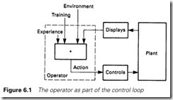
So far we have discussed connecting a PLC to the plant, and the ways in which the control is achieved. A PLC also has to ‘connect’ to the human operators, accepting commands from them and displaying the status of the plant in a form that can readily and easily be understood. This is known as the man–machine interface, or MMI, and can be summarized by Figure 6.1.
The study and design of this interface is known as ergonomics, and tries to ensure that operators can perform their duties efficiently, in comfort, and with minimum error.
The most important aspect is probably the worker’s immediate workspace and environment. Reliable error-free performance cannot reasonably be expected from an operator who has a headache or a sore back within an hour of starting work. Factors such as noise, dust, smell, vibration, humidity, temperature (and temperature changes), lighting levels (and glare) all contribute to a worker’s ability to concentrate.
Psychological factors such as stress and the degree of concentration needed are important, as is the ability to mentally rest and ‘coast’ for a short period from time to time. Directive 90/270/EEC and the HSE booklet Working with VDUs cover legislation regarding display screens.
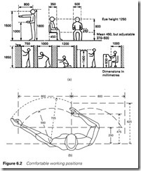
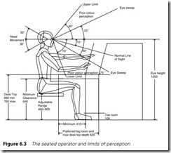
The layout of controls, displays and seating are important. Many desks the author has seen have been laid out for workers 1.5 m tall with a 3 m armspan. Figure 6.2 shows comfortable working positions for seated and standing operators, and Figure 6.3 the boundaries of human perception.
Simple digital control and indicators
Most of an operator’s controls will be simple digital devices such as switches, pushbuttons, joysticks and indicator lamps. These should be laid out within easy reach and view of the operator, as shown in Figures
6.2 and 6.3.
The function of controls should be made as clear and instinctive as possible. Useful techniques are grouping by function (with boundary marks on the desk surface) or grouping by different device manufacturer (e.g. Siemens controls on the clamp and Telemecanique controls on the press). One of the worst desks the author has seen had 14 visually iden- tical joysticks (but with different motion axis) arranged in a straight line along a (single-operator) 3 m desk top. At a nuclear power station in the USA the operators broke up a similar layout by crimping drink cans over the joystick handles; the Coke can was the long travel, the Fanta can the cross travel, the Pepsi can the raise lower and so on. This is actually a sensible idea if implemented with more style!
Desk layouts should be consistent, particularly where operators change jobs at regular intervals (a good practice; it maintains interest, prevents boredom and helps with training). On desks the author has designed, for example, emergency stop is usually top right-hand side, lamp test is bottom left-hand side, and fault indication/alarm is top left- hand side. This layout is not important, but the consistency is. For the emergency stop, the top right-hand side is most convenient for right- handed operators, and minimizes accidental presses.
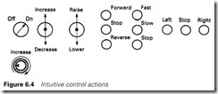
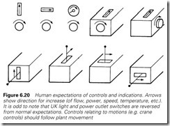
Consistency of operation is equally important. A clockwise switch for start in one location (the intuitive operation) and an anticlockwise switch somewhere else is confusing. Figure 6.4 shows the expected response for common controls. Where a control causes a plant motion (e.g. long travel, cross travel) the controls should mimic the plant.
Pushbutton colours aid clarity. Recommended colours (in BS-2771) are:
Red Stop, Off, Emergency Action Green Start
Black Other functions (e.g. jog, reset, test) Yellow Intervention (e.g. continue after a fault)
White/grey/blue can be used for ‘other functions’, but in practical indus- trial applications dirt degrades the colour clarity. The use of push-on/ push-off buttons should be avoided, particularly without a separate state (run/stop) indication.
Similar recommendations exist for the colour of indicator lamps:
Red Fault, danger, warning, action needed
Amber Caution, warning, operator should be aware of, deviation from normal, overload
Green Healthy, sequence running normally, ready Blue/white Informative, e.g. speed selections
A human being is very good at recognizing visual patterns, and can easily pick out a change. In normal operation a desk should be ‘green’ with perhaps the odd passing blue or white.
Ambers and reds suggest that action is needed. Wherever a lamp exists, a lamp test pushbutton should be provided.
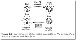
Illuminated pushbuttons are commonly used to reduce desk space. The intuitive method is to press the extinguished button, which then lights (and the other goes out) as in Figure 6.5. Running illuminated buttons should be green (and stopped buttons red) to give the green desk. It improves operator confidence if every action is confirmed in some way. In many cases this confirmation is automatic when the result of an action can be seen or heard. If there is no direct feedback (for a remote lubrication unit, say) a confirmatory indicator (probably from an auxiliary contact on the starter) should be provided. Operators intuitively expect a response in a time shorter than one second, after which there is a
growing sense of unease.
A plant should not, however, be over indicated. An operator can easily be swamped by a visual overkill. Above all avoid multiple flashing flick- ering lamp patterns. A flashing light demands action now and continual presence means a serious design error.
Numerical outputs and inputs
Numerical outputs
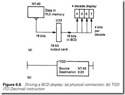
An operator’s desk will often have to display numerical data; hours run, position, temperature and so on. Usually these data will be held inside store locations in the PLC. Most digital displays operate in BCD (see Appendix), so a four-digit display (capable of showing 0000 to 9999)
will require 16 output signals from the PLC, usually at 12 or 24 V. Figure 6.6 summarizes this operation for a PLC-5, where the number in store location N7:40 is sent to the digital displays connected to a 16-bit output card in slot 3 of rack 2. One small complication is that, internally, PLCs work in binary. The output to the display is in BCD. All PLCs capable of handling numerical data have a simple instruction to convert from binary to BCD. For a PLC-5 (and the example of Figure 6.6(a)) this is the TOD (TO Decimal instruction) of Figure 6.6(b).
Multiplexed outputs
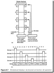
Figure 6.6 is a reasonable solution for one display, but one display/one output card becomes expensive and wasteful of I/O and cable where many displays are needed. A very economical solution is to use a multi- plexed output. The basic idea is shown in Figure 6.7(a) for four displays (although the idea can be extended almost indefinitely).
The digital displays have 16 data lines as before plus an additional strobe line. If the strobe line is high, the display reads in a number from the data lines. If the strobe is low the display memorizes (and shows) the last data. The four displays share the same output word which cycles through the data to be displayed. Strobe pulses are generated in the centre of each data word as shown in Figure 6.7(b).
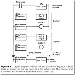
The basis of the program to achieve this is shown in Figure 6.8. A counter acts as the multiplexer ‘clock’ driven by pulses from else- where in the PLC program (a GEM-80, for example, has clock flags in the E data table). Three clock pulses are allocated per display; the first puts the 16-bit data onto the output word, the second energizes the strobe, and the third does nothing in the program, but has the effect of
removing the strobe whilst leaving the data on the output. (Once data have been written to an output, they stay there until the next data are written, whereas the coil will de-energize when its input conditions go false.) The program segment thus causes the strobe to energize in the centre of the data as in Figure 6.7(b).
The one disadvantage is speed. With eight displays, 24 ‘clock’ pulses will be needed per cycle. A typical clock pulse would be 30 ms, giving an update time of just over 0.7 s. This will normally be acceptable, the one possible exception being where the display is used to enter numbers from a keypad (similar to data entry on a hand-held calculator).
The idea can be taken further, down to multiplexing individual digits. An eight-digit display can be driven with just four data lines, three-digit select lines and a strobe. Eight displays of this type can be driven with just 11 bits; four data lines, three digit lines, three display select lines and one strobe. The program, though, would be lengthy (but simple) and the response rather slow.
Leading zero suppression
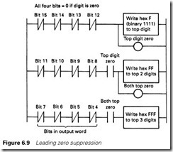
If we display 25 on a four-digit display, we want it to appear as 25 and not 0025. This is called leading zero suppression. A digital display driven in BCD normally uses one of the unused binary codes 1010 to 1111 to generate a blank display (usually 1111, ‘F’ in hex). Other unused codes often show + – and a decimal point.
We can therefore provide leading zero suppression for a four-digit display with the three rungs of Figure 6.9. These simply detect 0, 00 or 000 and write hex F, FF or FFF (or equivalent) to the display. It is usual not to blank the bottom digit, so 0 appears as 0. Figure 6.9 works equally well with multiplexed displays. The ‘write F’ instruction is simply the data OR’d with hex F000, e.g.
Numerical inputs
Simple digital inputs (pushbuttons, joysticks, switches) are normally allocated one input per motion, and require nothing particularly special.
A simplification is possible for multiple position selectors (an eight pos- ition rotary switch, for example) which can use binary coded contacts; position 6, for example, being represented by 110 on three input lines.
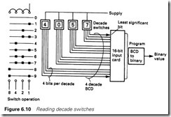
Where numbers are to be entered, however, there are two basic entry schemes. The first is BCD-coded decade switches. Each switch has 10 positions, and gives a 4-bit BCD output. To read a four-digit number thus requires a 16-bit input card as shown in Figure 6.10.
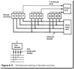
Where more than one value has to be entered, multiplexing can again be used to reduce the number of inputs required. The principle, for three four-decade switches, is shown in Figure 6.11. The diodes on each switch output prevent sneak paths through unstrobed switches. Normally these diodes are part of the switch construction and all the designer has to do is specify the signal polarity.
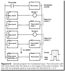
The multiplexing is controlled by a software counter as summarized in Figure 6.12. As with multiplexed outputs, the major disadvantage is a lower update speed, and a decrease in program comprehensibility.
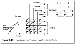
The techniques of multiplexing can also be used to minimize pushbutton/ switch cabling. In Figure 6.13 sixteen inputs are being read with four outputs, four inputs and an eight-core cable. Again, diodes are needed to prevent sneak paths. Speed of response and program comprehensibility are disadvantages as before.
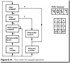
The second approach is similar to a calculator, with ten number push- buttons, Enter and Cancel pushbuttons and a digital display (driven as described in the previous section). The entered number is built up in
a buffer digit by digit by multiplying the buffer by ten and adding in a number each time a button is pressed. Figure 6.14 summarizes the operation.
Alarm annunciation
Faults inevitably occur in all plants, and as a result all bar the simplest system will incorporate an alarm system to draw the operators’ attention to developing problems. This alarm system can be as simple as a lamp saying ‘Pump Tripped’ or as complex as a large SCADA system which can generate thousands of alarm banners on computer screens.
Alarm systems are commonly installed without much thought, and this can cause problems. The alarm system at Three Mile Island gave wrong information to the operators. The alarm system at Milford Haven oil refinery produced an overkill of information which overwhelmed the operators. During the Channel Tunnel fire, the alarm system gave the wrong impression of the seriousness of the situation and delayed rescue
operations. At Chernobyl the alarm system itself was over-run and alarms were being automatically removed before they were presented to the operators.
An alarm system should make operators aware of a developing problem in time for appropriate action to be taken, and the operators should know what this action should be. It is worth listing the require- ments for a good alarm system:
The alarms should be clear, unique, concise and unambiguous.
If an alarm appears saying FT205 Low, does the operator know what this means? The author has seen alarms where even the designers could not explain the meaning.
The alarms should have a defined operator response.
Every alarm should be followed by an operator action. This could be starting another pump, putting the plant into a holding state or calling for help from the maintenance crew. If the operator does not know what to do the alarm is not achieving anything useful.
Alarms should not cry wolf.
If they do, the level of confidence in all alarms will be reduced and possibly important alarms will be ignored.
Alarms should be implicitly trusted.
If they are not, the plant will run with standing alarms, a potentially dangerous situation.
Alarms should only tell the operators what they need to know.
If they flood the operators with irrelevant information important alarms may be missed. For example, if an operator stops a fan this should not trigger any alarms unless the plant responds in an unexpected way.
Alarms should only occur when the operator has time to respond.
Giving the operator one second notice of a problem requiring deep thought and complex action is pointless.
One of the biggest problems with alarm system is a single problem which can result in a deluge of alarms. In the five hours before the acci- dent at Milford Haven oil refinery in 1994 the operators were presented with a new alarm every two to three seconds. They barely had time to accept the alarms let alone understand them or take appropriate action. Alarm floods can be reduced by grouping of alarms so only first up in a group is given. A two pump hydraulic system operating a cylinder,
for example, could have the following alarms:
Pump Stopped Low Pressure
Standby pump failed to start
LowLow oil level
Cylinder stroke not achieved in five seconds If there is an oil leak, LowLow oil level will occur, the pump will stop automatically (to avoid pump damage), the system pressure will fall, the standby pump will be inhibited from starting and the cylinder will not move. One fault could thus cause five alarms. A first-up alarm system will inhibit alarms which will naturally follow from the first event.
Alarm floods can also be caused by repeating alarms. These are com- monly caused by an analog signal which is just wandering either side of an alarm trigger point These can be reduced by hysteresis with the alarm event and alarm clear occurring at two different setting as shown later in Figure 9.10. A simple way of achieving this is shown in Figure
9.11 in Section 9.4. An alternative approach for reducing repeating alarms is to give the operator the ability to Shelve alarms; i.e. provide a function which says ‘Don’t tell me about this again for (say) thirty minutes’.
Alarms should have different priority levels. The priority will be a function of importance and the speed with which an operator must respond. At the highest level will be problems related to personnel safety, followed by problems which require immediate action to avoid expensive plant damage or extended loss of production. Lower level alarms are less important or require less urgent action. Commonly three alarms priority levels are used. Alarm floods can be reduced by allowing the operator to ‘shelve’ the lower level, and hence less important, alarms.
SCADA systems invariably include an alarm system and these usually display alarms which appear as a banner on the screen which must be acknowledged by the operator. It is usual to store these alarm banners in an alarm history file which shows the time at which the alarm occurred and the time the alarm was accepted. These alarm histories, commonly called an Alarm Log, can be very usual for fault finding or subsequent post mortems. They are essential if the alarm system does have a ‘first-up’ system to filter alarms.
Alarm systems frequently have too many alarms. Great care should be taken to ensure that the alarms are really alarms. If a combustion air fan trips this is almost certainly an alarm event. If the operator stops the fan for production reasons this is probably not an alarm event. It is very useful, both for maintenance and production, to keep a log of plant events, but the difference between events (which should be logged without operator action) and alarms (which require operator action) should be clearly understood.
Most alarm systems attract the operators’ attention with audible alarms. These certainly demand attention but continuing alarms can be very stressful and can distract an operator when careful thought is required. An alarm flood with each alarm accompanied by intrusive sounds can be totally self defeating. If alarms can occur frequently or in a flood the operator should be given the opportunity to mute, or at least reduce the volume of, the alarms. Spoken alarms, commonly used on aircraft for collision avoidance and ground warning systems, are very effective if applied sensibly. Soft female voices suggesting the correct action are recommended. Most modern SCADA systems permit sound files to be attached to alarms.
Alarm duplication commonly occurs where simple lamp based alarm annunicators are used along with banner alarms on computer or PLC driven screens. If these are not planned with care the operator may end up having to accept an alarm on the annunciator then accept the identical alarm on the computer system. This wastes valuable time and increases operator workload and stress. Even worse it can cause considerable con- fusion if the identical alarms have different descriptions (e.g. LE205 level on the annunciator and Imminent Sump Overflow on the computer banner).
Analog indication
Where a PLC is concerned with analog signals, flows, temperatures, pressures, etc. these will usually be displayed to the operator. Section 6.3 discussed the display of information with numerical digital displays. In this section we will consider analog displays, i.e. meters and bar- graphs.
Analog meters and digital displays can both be used to display varying signals, so it is best first to consider their good and bad points. A digital display can display a value to any achievable resolution and accuracy; a four-digit display has a resolution of 0.01% of full scale. An analog meter, however, can only be read to a resolution of about 1% of full scale, regardless of the accuracy of the signal. If high accuracy is needed, a digital display is best.
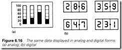
An analog meter, though, is best used where an operator is required to pick up a general pattern or impression without a great need for accur- acy. Digital meters need to be read individually. The rogue temperature on the bar graphs of Figure 6.16 can be seen instantly; the same data on digital displays are far less obvious.
Another consideration is the speed of change of signal. Digital dis- plays need time for the human mind to assimilate the information. With fast-changing data on a four-digit display, all the eye sees is 8888. In situations where the operator is required to handle fast-changing signals, an analog meter is preferred.
There are also implications for the cost of the system and the ease of maintenance, which will depend on the specific application. A three-digit
For simple systems all that is required is a lamp for each alarm which operates as Figure 6.15. When the alarm occurs the light flashes. When the alarm is acknowledged (accepted) by the operator the lamp goes solid if the alarm is still present, or goes out if the alarm was a transient event which has passed. Normally an audible alarm is sounded until the alarm is accepted. It is good practice to have two bulbs for each alarm and provide a lamp test button on an alarm annunciator.
digital display requires around 14 signal lines, plus a supply. An analog meter requires just two (but needs one output from a relatively expensive analog output card). Digital meters have no moving parts whereas analog meters are less robust and can be damaged by sharp blows.
A meter scale should be chosen to be easy to read at the normal viewing distance. A useful rule of thumb is a scale length about 1/15th of the viewing distance (e.g. 20 cm scale length for a 3 m viewing distance). Figure 6.17 shows different meters with identical scale length. Normally 20 scale divisions are used. With a correct choice of viewing distance/scale length, an observer can interpolate to one-fifth of a scale
division to give a resolution of 1%. Perhaps surprisingly, more than 20 scale divisions can decrease the resolution by making the scale look cluttered and difficult to read. Figure 6.18 shows typical scales readable to 1%. Meters to higher accuracy are available (BS89 defines nine accur- acy ranges from 0.05% to 5%), but they have little practical application in industry.
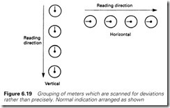
Meter ranges should be chosen so that a normal reading is between 40% and 60% of full scale. If a block of meters is to be quickly scanned for an anomalous reading, the ‘normal’ value should be at 9 o’clock for a horizontal row of meters, or at 12 o’clock for a vertical column, as shown in Figure 6.19.
Where a signal (shown on a meter) is to be controlled, it is important to have the correct link between the signal movement on the meter and the operator’s expectation. Everyone expects ‘increase’ to equate to ‘up’ or ‘clockwise’, giving the relationships of Figure 6.20.
Computer graphics
Introduction
So far we have discussed individual operator devices, pushbuttons, switches, indicators, analog meters and digital displays. Increasingly all of these functions are being provided by computer graphics screens. This can be a display device designed specifically for a particular range of PLCs (the Allen Bradley Panelview and the CEGELEC Imagem which we will discuss in the following section are of this type), general purpose graphic display devices (such as ABB/ASEA’s excellent Tesselator) or graphics software running on conventional industrial computers.
It is useful, as ever, to first consider the merits and disadvantages of using computer displays. If everyone was totally honest, often the main reason for the choice is that they look good and impress visitors. Too often the result is stunning colourful flashy graphics that are impossible to view for more than a few minutes without acquiring a headache, have to be searched for useful information and have an update speed of several seconds. At my site several plants are controlled by screen, and there are usually spectacular ‘visitor’s screens’ and more mundane, restful (and useful) working screens.
The major advantages are simplicity of installation and flexibility. A graphics terminal has just two connections to the outside world, a serial link connection (see Chapter 5) and a power supply. If it is used to replace a desk full of switches and indicators there are obvious cost savings. A good quality switch occupying about 60 ´ 40 mm of desk space costs about £20 at the time of writing, to which must be added 1/16th of the cost of an input card, a share of a PLC rack, about three connectors, one core in a multicore cable plus labour for building the desk and PLC cubicle, pulling the cable, and ferrulling the cable cores. A single device can be very expensive when all the costs are considered. There are software costs and a large capital cost for a graphics terminal, but these generally work out significantly cheaper.
The designer of desks or control stations often has to deal with changes and modification (another example of the ‘didn’t we tell you’ syndrome which usually manifests itself as a retrofitted 30-mm push- button with dymotape label in a desk originally fitted with 20-mm controls). Constructing a desk is always a fine balance of time, choosing between waiting until all the requirements are clear, and the minimum time needed to make it. Modifications at the commissioning stage rarely look neat.
The displays on a graphics terminal can be modified relatively easily, and, more importantly, the modifications leave no scars. If the design of a normal desk can only start when the desk contents are 95% finalized (which is about right) a graphics screen can be started at 75% finalized. This flexibility is of great assistance as no job is ever right first time.
There are disadvantages, though. The most important of these is the limited amount of information that can be displayed on a single screen. It is very easy to overcrowd a screen (giving a screen similar to a page full of text on a word processor), making it difficult for the operator to identify critical items. A useful rule of thumb is not to use more than 25–30% of the screen. For a typical 80 ´ 25-character screen this means about 500 available positions, which include both identifying text and data. ‘Motor Speed NNNrpm’, for example, uses 16 characters.
The effect of this is often a need to build up a hierarchy of screens,
the top screen showing an overview, lower screens showing more and more detail. The problem with this is the time delay needed to shift through the screens. Direct screen to screen movement is possible by calling for a page number (which needs a good human operator memory, or a directory piece of paper, or wasted screen space) or by making all screen changes via an intermediate directory page (with additional delay). These time delays are small (less than a second typically) but the cumulative annoyance is large.
The time taken to update screen data can also be problematical, par- ticularly where a machine to machine link is involved. Again a response
time of around one second is typical, but several seconds is by no means uncommon. The use of a graphics terminal for fault finding on a fast- moving plant is not really feasible.
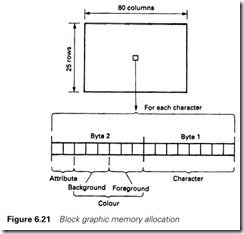
There are generally two types of graphics terminal. The simplest, known as block graphics, has one store location for each character pos- ition on the screen. An 80 ´ 25-character display will thus have 2000 store locations. Each location will commonly have two bytes (one 16-bit word) arranged as in Figure 6.21. The first of these holds the character to be displayed, a single byte giving 256 possibilities. Standard ASCII (see Table 5.1) provides 128 alphanumeric characters, the other 128 being assigned to useful semigraphics characters. Figure 6.24 shows some of the block graphic symbols available on IBM PC clones, and the Allen Bradley Panelview. The second byte determines the colour, using 3 bits for foreground colour (giving eight colours) and 3 bits for back- ground colour (again 3 bits), leaving 2 bits for functions such as flash, double height or bright/dim.
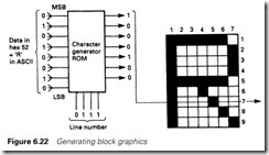
The second type of display deals not with individual characters, but with individual points on the screen called ‘pixels’. Characters are built from pixels, typically 8 wide by 14 high (for EGA on an IBM-PC, giving a total of 112 pixels per character), the pattern for each character being stored in a read only memory (ROM) as in Figure 6.22.
A typical medium-resolution screen will have 640 (horizontal) by 350 (vertical) pixels, a total of 224 000 points. High-resolution screens for computer aided design (CAD) use even more pixels. Each of these can be accessed individually, allowing lines to be drawn at any angle, fill patterns of any type to be used and trend graphs of plant variables to be displayed. Each individual pixel can have its own colour (from over 256 possible colours in some displays) and intensity. The result is an almost photographic resolution.
There are additional costs, the most obvious of which is a large store requirement. The system hardware and software are more complex (and hence more expensive) but, perhaps surprisingly, this is not appar- ent to the user; pixel graphics displays are often easier to program than block graphics units. Recent home computers (from the era of the BBC and the Spectrum) have all used pixel graphics.
The next two subsections look at examples of block graphics and pixel graphic displays. The first example (the Allen Bradley Panelview) is a relatively simple block graphics display designed to replace simple desk controls (pushbutton, indicators, bar graphs, digital displays and simple mimics). The second, the GEM-80 Imagem, is a more sophisticated display system using pixel graphics and a powerful graphics language.
All PLC manufacturers have graphics packages, usually both block and pixel. Allen Bradley, for example, have the pixel-based Controlview, and the GEM-80 has a simple block graphics video processor. Siemens have the SCADIX family, ABB the Tesselator, and so on. There are differences in the progamming methods used by each (although the basic ideas are similar). To cover all would be time consuming, tedious and confusing. The two examples below were therefore chosen from
equipment I have ready access to, not by way of any recommendation over other manufacturers.
The Allen Bradley Panelview
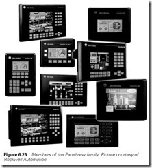
The Allen Bradley Panelview family shown in Figure 6.23 is designed to replace switches, pushbuttons, numeric displays and similar devices. It is available in keypad or touchscreen versions, with both having monochrome or colour displays. In the keypad version, operator actions are linked to function keys, in the touch screen version 120 touch cells are available.
All Panelviews use a VGA screen with 640 ´ 480 resolution which can display full uppercase/lowercase alphanumerics (for normal text)
plus built in ISA (Instrument Society of America) symbols for motors, pumps, etc. Bitmaps can also be imported to provide user designed graphic symbols or backgrounds.
The unit can have several ‘pages’ of displays, the limit (set by the memory) is around 40 pages of reasonable complexity. These are pro- grammed with a standard IBM PC clone.
Any display contains two distinct types of object. Static objects are fixed and do not change. These are used for fixed text, fixed titles, and unchanging graphics. More interesting are dynamic objects. These are linked to inputs, outputs and numerical data in the controlling PLC.
Panelviews use various forms of serial communication to link to the PLC, including DeviceNet, ControlNet, Data Highway and RS485. The version we shall discuss as an example in this section connects to the PLC via the normal remote I/O cable and looks, to the PLC, like one rack of standard I/O cards. The form of communication and the rack number is part of the initial configuration of the Panelview. An indicator on a Panelview screen, say, could be allocated to bit 3 of card 5 in rack 7, and be driven by address 0:75/03 in the PLC program. Similarly a button on the screen could be assigned to bit 14 of card 2 also in rack 7 and read by the program as I:73/14.
Dynamic objects are added by selection from pulldown menus. These include:
Displays to the operator:
Multistate indicator (Running, Stopped, Tripped, Isolated, Fault, etc.) Numeric Displays with fixed or floating decimal point (Tank Contents
4057 litres)
Bar graphs and scales (vertical or horizontal) Circular meters and scales
Alarm messages (appearing as windows and can be stored on an alarm history page)
Message displays (predefined messages with stored ASCII strings such as ‘Drill Sequence now completed’). These strings can also include embedded data from the PLC (‘Warning: motor current is NNN amps’).
Data inputs from the operator:
Pushbuttons. A selection of five different types, including normally open, normally closed, latched, maintained and interlocked (select one and only one from a group). Pushbuttons can control a single bit or write a numeric value to a PLC. A pushbutton also includes a two state indicator whose message can be controlled by a PLC output.
Numeric input, either from pushbuttons or a pop-up keypad
List Selector, used to select one, from several, control options (e.g. calibrate, test, run, shutdown)
Control functions such as select a different screen or accept an alarm.
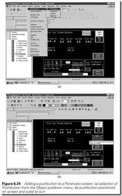
Panelview screens are built using the Panelbuilder software running on a normal PC screens. Figure 6.24 shows the steps used to add a push- button to a screen.
Figure 6.24(a) shows a summary of the Panelview contents on the left- hand side. The Panelview screen Timed Cut has been selected followed by the pull down menu for objects and selection of Pushbuttons. Clicking on Momentary bring up a pushbutton which is placed and sized on the screen with the mouse as Figure 6.24(b).
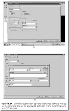
The button must now be configured. Double clicking on the button brings up the window shown in Figure 6.24(c). The button has been selected to be a single bit, buttons can also be configured to write a value to the PLC.
A button has two links to the PLC; an input where its action will be performed and an output used to control the state (e.g. Running/ Stopped) on the button display. The links are done by tags. These are text descriptions of the link. The new pushbutton is an alarm accept button, and the two links are Reset_PB (for the input) and Alarm_Present (for the output). These tags can be defined in advance (which is quickest when starting a project from scratch) or defined as each object is added. Selecting a tag, Reset_PB say, and clicking the Edit Tag button brings up the Tag form of Figure 6.24(d). Here the data type (bit) and the destina- tion address (I:12/03) are entered. The Node Name is the PLC to which this Tag applies. For the simple Remote I/O there can be only one PLC, but Panelviews with Peer to Peer links such as Data Highway can exchange data with many PLCs. Node then defines the PLC to which the tag applies. The initial value defines the data sent to the PLC on Panelview power-up. When all data has been entered the OK button is clicked. The Alarm_Present output tag is entered in a similar way.
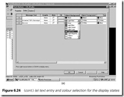
Next the states of the button display must be defined. Clicking on States on Figure 6.24(c) brings up the state window of Figure 6.24(e). The button should be invisible when there are no alarms, and appear when there are alarms. Foreground and background colours can be defined for the text and the object itself. State 0 (healthy) thus has all foreground and background colours set to black and no text. State 1 has the text Alarm Accept (with /*R*/ denoting a new line). Colours can be defined with pull-down menus as shown or by clicking with left or right mouse buttons on the colour pallets visible on Figure 6.24(b). Font size and aligment controls can also be seen on this figure.
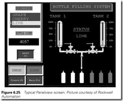
Figure 6.25 shows a typical complete Panelview screen.
Pixel graphics; the CEGELEC Imagem
The Panelview built up a graphics screen with semigraphic characters placed on a screen with a ‘pick and place’ menu approach. The GEM-80 Imagem is a true pixel graphics system where the programmer has
access to every individual pixel on the screen. It should, perhaps, be noted at this point that Allen Bradley have a pixel graphics system (called Controlview) and Siemens the SCADIX graphics video processor. Most PLC manufacturers have both types.
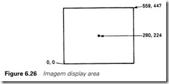
The display area on an Imagem screen consists of over a quarter of a million pixels arranged 560 pixels wide and 448 pixels high. A point on the screen is defined by an X and Y coordinate arranged as shown in Figure 6.26 with point (0,0) arranged at the bottom left-hand side. (IBM-PC clones have an awkward system with 0,0 at top left.)
On any screen the programmer can use a palette of 16 colours. These are 16 genuine colours which can be chosen from a palette of 4096 colours and the tints can be changed by variables in the PLC program.
Pixel graphics are more powerful than block graphics, and this means that the programming is more involved to use the additional features. The Imagem uses a display language which has features common to the graphics command on a good quality desktop computer (move, draw, etc.) and mathematical functions for graphical construction involving trig- onometry. The programming function CONSTRUCT is also provided, allowing the routine for drawing a valve, or a conveyor, or a hopper to be defined once and then called by a name (such as VALVE). Characters are based on the ASCII set (see Table 5.1) with 128 undefined characters. These can all be redefined with a character editor to produce any desired symbols. Characters can be drawn in any size (with different magnification in the X and Y direction).
In the rest of this section we will look at some of the features of the Imagem display language. In the space available this can be little more than an overview (the Imagem Programming Manual has over 200 pages) but should give an appreciation of the approach used with pixel graphics systems.
The display language is closely related to high level languages such as BASIC or Pascal. For example, to put a simple message on the screen you would write
FOREGROUND WHITE BACKGROUND BLUE WINDOW 0,0 559,447
MOVE 205,210
SIZE 2
‘Have a Nice Day’
Here the colours are defined by the FOREGROUND and BACK- GROUND commands, the WINDOW command says the area this definition applies over (the whole screen), the MOVE command places the cursor at X= 205, Y = 210 (near the screen centre) and SIZE 2 gives double height text.
Data in the PLC program can be added to text. Assuming colours and size and position (MOVE) have been set up we can write
‘Feed Rate = ’
DECIMAL ^##.##,W[235]
‘l/min’ NEWLINE
‘Tank Level = ’ DECIMAL ^^#.#,W[236]
‘metres’
Here the PLC program is accessed for the values to be displayed. The feed rate is held in the GEM location [235] and the tank level in location
[236] (see Section 2.3.4 for a description of the GEM-80 data table). The DECIMAL command says how this is to be displayed, defining both the number of characters and the decimal point position. The caret ^ is a blank position and the hash # a number. The above instructions could produce:
Feed Rate = 15.25 L/min Tank Level = 3.7 metres
Mathematical functions can also be included, for example:
‘Total Water Flow = ’
DECIMAL, ^####,G[17] + 10*G[23] + W[146]/2
‘gpm’
We set the foreground and background colour earlier with default colours. The programmer can define a colour (up to a palette of 16 on any one screen) and even have colours varied by PLC variables. A col- our has a name, and, in its simplest form, percentages 0–100% of the component colours red, green and blue. You could define, for example,
COLOUR PINK 80,10,20
or a colour controlled by plant variables
COLOUR PWRLEVEL G[10],G[11],G[12]
With the latter, a definition FOREGROUND PWRLEVEL will cause text (or graphics) to the next foreground definition to be set by the values in the variables G[10] to G[12].
Flashing characters have a larger definition with main colours (RGB) followed by on time (in tenths of a second) followed by inverse colours (RGB) and off time (again in tenths of a second), for example
COLOUR ALARM 100,0,0,4;50,0,0,2
which goes from bright red to dim red.
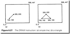
Symbols and mimics are drawn with lines, arcs and filled blocks. A line is drawn with the command DRAW X,Y which draws a line from the current cursor position to position X,Y. The instruction
MOVE 100,100
DRAW 200,200
would thus produce Figure 6.27(a) and
MOVE 100,100
DRAW 200,200
DRAW 300,100
DRAW 100,100
would give Figure 6.27(b).
These have defined positions in absolute screen positions. It is often useful to use relative positions, particularly when the graphics involve variables. Relative commands are RMOVE and RDRAW. Figure 6.27(b) could also be produced by
MOVE 100,100
RDRAW 100,100
RDRAW 100, -100
RDRAW -200,0
The line width can be set with a size command; SIZE 5 gives lines 5 pixels wide. The line type (dotted, dashes, etc.) can be defined with a suffix; for example
DRAW 157,203,3
gives a dotted line (denoted by suffix 3) to position 157,203.
The draw commands can be related to a value in a PLC data table location. For example, to draw a bar graph we would write
SIZE 7
MOVE 0,400 DRAW W[62],400 MOVE 20,20
DRAW 20,W[45]/62.5+15
This would draw two bar graphs; one horizontal directly linked to W[62] and a vertical one determined by a bit of maths on the contents of W[45].
A block of bar graphs can be drawn by using the FOR command. This operates like a FOR/NEXT loop in BASIC, or the FOR/BEGIN/ END construct in Pascal. The form is very similar to Pascal, in fact, with open brackets ‘(’ being used for begin and close brackets ‘)’ for end. For example
SIZE 7
FOR A=1 TO 10 (MOVE 20*A,20 DRAW 20*A,W[15+A])
draws ten vertical bar graphs for the values in W[16], W[17], etc. to W[25]. Here ‘A’ is an internal Imagem variable.
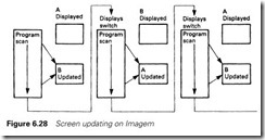
At this point you might be confused about how graphics controlled
by plant variables can be changed without erasing the old values or causing annoying flicker. The principle is shown in Figure 6.28. The Imagem has two screens; let us call them A and B. When screen A is being displayed, screen B is updated in the background from the pro- gram. When this update is complete, the screens are switched, B being displayed and A updated. This toggling is invisible to the user, but gives very smooth updates. It allows an analog meter pointer to be simulated with
MOVE 200,200
DRAW 50*COS[90*W[127]/1500],50*SIN[90*W[127]/1500]
which draws a line 50 pixels long from 200,200 at an angle determined by the value in W[127] with 90 degrees corresponding to a value of 1500.
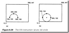
Arcs can be drawn with a VIA command
MOVE 100,100
DRAW 300,100 VIA 200,200
gives Figure 6.29(a), and
MOVE 100,100
DRAW 100,100 VIA 300,100
gives a circle as in Figure 6.29(b).
Predefined words are provided for a triangle
TRIANGLE Xl,Yl,X2,Y2,X3,Y3
and a rectangle
RECTANGLE X1,Yl,X2,Y2
where the points define opposite corners. A suffix defines the line type (solid, dashed) as described for the DRAW command. The programmer can define a shape, a conveyor, say, and repeat it with
CALL CONVEYOR (parameter list, e.g. size, position, state)
Solid shapes can be produced by moving inside a CLOSED shape and using the command FILL.
Conditional tests are often needed to show the plant state; alarm conditions or running/stopped are common examples. These are pro- vided by the IF/THEN/ELSE command which, in its simplest form, can change a colour:
MOVE 50,450 IF A[14].3 THEN
FOREGROUND GREEN
(‘Running’)
ELSE (FOREGROUND RED
‘Stopped’)
where the plant I/O signal A[14].3 changes the message, and colour, on the screen.
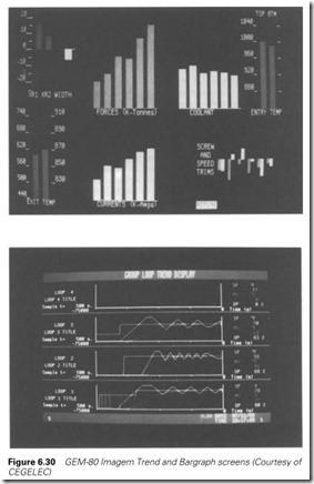
So far we have discussed just one screen. Obviously, to be useful, a graphics system must be capable of displaying several screens, and having some method of changing between screens in a controlled manner. The screens constructed above (the GEM calls them Formats’) are edited and stored in a memory card which is accessible to the GEM-80 and one (or more) Imagem processors. An Imagem can display up to four formats (or screens) at any time (the effect is similar to windows on an IBM-PC clone). The controlling GEM-80 has an L table in its data table in which each Imagem has four locations, the first, not surprisingly, having L0, Ll, L2, L3. Into these are written the format numbers that are to be displayed. For simple, non-overlapping screens only one of the four will be used, and the others will contain zero. Figure 6.30 shows typical Imagem screens.
The Siemens Simatic HMI family
Siemens provide a vast range of operator terminals from simple text only message displays to complete computer based Scada systems.
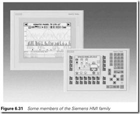
Typical members of the family are shown in Figure 6.31. Based on Win- dows ME they communicate with the controlling PLCs via Profibus DP (see Section 5.5.7) and other common serial communication standards.
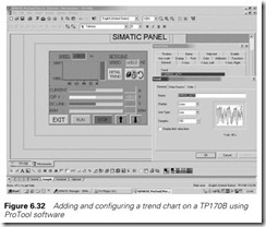
The terminals are configured using the Siemens ProTool software shown on Figure 6.32. Here a trend chart is being added to a touchscreen TP170B terminal.
Screen based operator interfaces are becoming increasingly common, and the Siemens C7 device deserves particular mention. Rather than have a separate PLC and operator terminal this combines the two in one device. The C7 is the plant display screen AND the plant PLC. It uses the Siemens S7 standard PLC software for control and the ProTool software for screen configuration.
Practical considerations
One major advantage of graphical displays is that mistakes can be rectified without leaving scars, albeit at some cost. None the less it is far better not to make mistakes in the first place. Perhaps the most important consideration is to realize that the system is being designed for an operator
who will be sitting in front of it for about eight hours a day, and not for the managing director and visitors. By all means include impressive ‘vis- itor’s screens’, but remember the poor operator. Above all, remember that you are not designing a video game.
A typical mistake is overuse of flashing displays (and flashing lights
on desks). A video display (or a desk) in normal operating conditions should not flash or blink. Flashing should only be used to attract an operator’s attention (an unaccepted alarm, for example) and should go steady when the operator acts. On a screen, a flashing small box alongside fixed text is much more friendly and easier to assimilate than flashing text. Text flashing in varying intensity (bright to dim) is better than text on/off and avoid text and background switching colours, which is almost impossible to read.
Another common problem is screens which SHOUT AT YOU IN UPPER CASE all the time. Only Death in the Discworld novels SPEAKS IN UPPER CASE. Text in lowercase is much easier to read. The use of Capital Letters for the first Letter of each Noun or Verb also makes interpretation easier. Look how the text on road signs is displayed. All modern screens can support upper case and lower case. Careful use
of initial capital letters can be used to emphasize text and draw the operator’s attention. Think about layout.
Screens should be uncluttered and consistent. The 25–35% usage rule is a good starting point as it allows an operator to quickly scan a screen for relevant information. Consistency ensures that similar operations are performed in similar ways, with colours having the same meaning on different screens. Pumps should not, for example, be run with separate start/stop pushbuttons on one screen, and with push on/push off single buttons on another. If an ‘End of Travel’ limit switch is yellow on one screen, it should be yellow on all (and not red, green or blue). Consistency problems normally arise where more than one person has been involved, and can generally be overcome by laying down standards at the start of a project.
Bright colours (yellow/white) tire the eye, and should not be used in large areas (and should be avoided for background colours). Overuse will cause the operator to turn the brilliance down, possibly losing information in dark colours as a result. Grey is a much more restful background colour. Blue characters on a black background are par- ticularly vulnerable to vanishing if the contrast or brilliance is turned down.
Good colour combinations are black on green, black on yellow, black on red, red on white, blue on white, green on white, red on black, green on black and white on blue (the latter is very good for large areas of text and is often used for word processors).
Colour combinations to avoid are yellow/green and yellow/white (which merge together) and blue on black for fine detail (the visibility is very dependent on the setting of the contrast and brilliance control). Cyan/blue is also poor to the point of vanishing into an unreadable bluish block.
With touchscreens, a useful standard is colour on black for an unac- tivated pushbutton, and black on the colour for an activated state. With start and stop buttons, for example, in the stopped state the start button would show ‘Start’ in green on black, and the stop button show ‘Stopped’ in black on red. When the start button is pressed, it changes to ‘Running’ in black on green, whilst the stop button changes to ‘Stop’ in red on black. Note the text changes from allowed action to state.
The environment around a display needs to be carefully considered. Most screens are mounted angled up, and are prone to annoying reflec- tions from overhead lights and windows. Bright lighting (and above all direct sunlight) can make a display impossible to read.
Displays are also adversely affected by magnetic fields. Close proximity to electric motors, transformers or high-current cables will cause a picture to wobble and the colours to change. The effect can be overcome by
screening the monitor with a mu-metal cage (normal steel or iron does not work).
The size and weight of the monitors are often overlooked, making them difficult to mount neatly, and even more difficult to change. Access should be made as easy as possible; trying to hold a 25-kg display in place with one hand whilst undoing interminably long mounting screws is not much fun.
Displays fail, and the implication of this needs to be considered in the design. If all the plant control is performed by screens, what will happen during the ten or so minutes it will take to locate a spare and change the faulty unit? Often, dual displays (main and standby) are used to over- come this problem.
Data entry
The operator will obviously need to input data and initiate actions. Keyboards are one approach, but many people are nervous of them (home computers help here) and the cable connecting the keyboard always seems prone to damage. In dirty environments keys can become blocked with dirt and membrane keypads with tactile (feel) feedback should be used.
Another useful approach is softkeys. Here a set of buttons (often 10) is positioned on the keyboard below a set of (software-driven) blocks on the screen. The pushbutton can thus change their meaning as the screen changes, as shown in Figure 6.31.
If the operator has to access points anywhere on the screen, a tracker ball is a useful device. Rather like an upside-down mouse it controls the movement of a cursor on the screen. All normal actions can be per- formed with three buttons on the trackerball and a numerical keypad. Trackerballs work surprisingly well in dirty environments as they are open underneath and dirt seems to fall straight through. Mice perform a similar function but are vulnerable to damage and dirt and are hence more suited to an office environment.
Touchscreens have already been mentioned briefly. Combining a display area with operator controls they provide a very compact inter- face, but their use should be tempered with care. There is absolutely no tactile feedback for the operator to sense a button, so their use is not recommended for an application where the operator has to look at the plant (and not the screen) when operating controls.
It is also easy to operate buttons by mistake. A similar effect can occur when a touchscreen is cleaned; a blank screen should always be provided for this purpose. The continued touching of the screen leads to a build-up of greasy fingermarks, accentuating this problem.
Message displays
Where a simple text message is to be displayed, possibly with embedded data, message displays driven by a simple serial link carrying ASCII coded characters can be used. The controlling PLC simply stores an ASCII string in its memory and outputs it, with added variable data, via a device such as the ASCII module described in Section 5.2.8. An alter- native approach is to store precoded messages in the display itself, with the PLC having a few parallel lines allowing it to say ‘Display message 23’.
SCADA packages
PCs have much better graphics capability than the average PLC, so it is not surprising that PCs are increasingly being used as the link between humans and PLC systems. These are usually called SCADA systems (for Supervisory Control and Data Acquisition). As the name implies these act as a higher level supervisor, and are commonly used for deter- mining plant set-ups and displaying plant status on high quality screens. They also provide storage for several days performance records allowing problems to be investigated after the event.
Other common features are trending (producing time based historical graphs of plant data) and alarm annunciation. The use of the latter fea- ture needs some care. The ease of adding alarms into a SCADA system can lead to a large number of alarms which can swamp the operator and be ignored. An alarm overkill is thought to have been a major contribu- tory factor in the explosion at Milford Haven oil refinery in 1994 when the operators were exposed for several hours to alarm messages at the rate of over thirty per minute. SCADA systems are vulnerable to this problem, but any alarm system should have priority groups and some form of first-up system which blocks consequential alarms. The topic of alarm annunciation is discussed further in Section 6.4.
The security of the system should also be considered. If a SCADA system fails, what controls will be needed during the thirty or so minutes that it will take to change for a spare, can the plant run blind for this time, or should there always be a second, standby system?
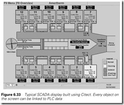
Figure 6.33 shows a typical high quality SCADA display built on the popular Citect package. This consists of many objects which are linked to data inside a PLC. The operation, like the Panelview described in Section 6.6.2, is built around ‘Tags’. These can be considered as a database of plant information which is built by the PLC. Definition and construction of the Tag database is the main part of the work in building a SCADA system; the construction of the screens is pure undiluted fun!
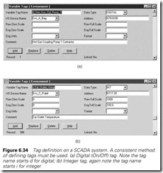
Figure 6.34 shows two typical tags. The first is a digital signal saying a pump is running. The Field I/O Device Name defines the PLC from which this signal can be obtained. Elsewhere the communication method (e.g. Ethernet) for obtaining data from this PLC has been defined. The address, bit 8 of word N70:0, defines from where the data can be read. If this is true, Pump 1 contactor is energized, and this information can be used on a screen to, say, turn the colour of a graphic symbol for a pump to green.
The second tag, on Figure 6.34b, is numeric and gives a temperature. This is obtained from the PLC known as Env_C_Pulpit. Scaling can be performed on numeric values, in this case 0–1000 corresponds to a temperature of 0–100.0 °C. Engineering units (e.g. psi, °C) can be permanently attached to the value and a fixed format (e.g. ##.#) can be defined but they have not been used in this example.
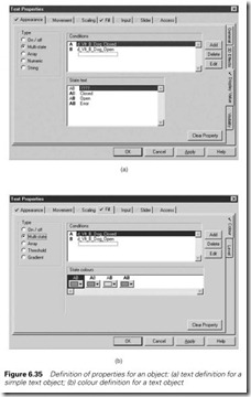
Once the tags have been defined they can be used on the display. Objects are selected in a way similar to most paint packages. Each object has a vast array of parameters which can be linked to the tags. Figure 6.35 shows a very simple example for a text object. Here there are two limit switches saying a damper is in the open or closed
position. Figure 6.35a shows the text associated with these limits. If only one is present the text gives the state. If neither is present, during movement for example, ???? is displayed. If both are present there is a fault.
Figure 6.35b sets the colour of the text for each of the four possible states. Legitimate states (open/closed) are Green, the transitional state is Yellow and the fault state is Red. Note, though, the other tabs around the object for other functions that could be applied. The range of possi- bilities is vast.
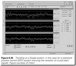
Trending is one of the strengths of SCADA systems. Any tagged variable can be trended, and custom displays can be built by operators. Range in the Y direction and time-base in the X direction can be
selected and changed, to aid fault finding for example. Figure 6.36 shows a typical trend display used, in this example, for statistical process control (SPC). Note the scrolling, zooming and scaling controls on the screen.
