The Art of Color
In This Chapter
▶ Understanding color classifications
▶ Knowing which colors are right for you
▶ Using color to enhance your appearance
What’s your favorite color?” How many times has your daughter, niece, or nephew asked you that question? No matter our age, we all have favorite colors. I love white and always gravitate toward a white dress, T-shirt, or jeans. But the truth is that your favorite color may not be what looks best on you. Your hair, eyes, and skin tone all play a part in selecting colors that belong in your closet.
This chapter explains how to use colors to highlight the parts of your body you love and camouflage the ones you don’t. Also, if you’re challenged in the what-colors-go-with-what department, I guide you through that as well.
Color Wheel Basics
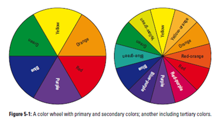
If you’ve ever looked at a rainbow (and I’m sure you have), you know that colors appear in a natural order. This is called the color spectrum. Designers like to show the color spectrum in a wheel (like the ones shown in Figure 5-1). It turns out there’s a practical reason for doing so: Not only are there visual effects when specific colors are compared to colors adjacent to them on the color spectrum, but there are also visual effects when a color is compared to the one opposite itself on the color wheel.
You may think it’s a coincidence that suddenly some colors are very in, but it’s not. An organization called the Color Marketing Group pulls in experts from different fields — fashion, interior design, and so on — and decides what the popular colors are going to be two years from now.
Color designations: Primary, secondary, and tertiary
Colors fall into the following three categories (refer to Figure 5-1):
✓ Primary: The three primary colors are red, blue, and yellow.
✓ Secondary: When you mix the primary colors in specific combinations, you get the secondary colors: purple (red and blue mixed), green (blue and yellow), and orange (red and yellow). If the mixture is not exactly 50 percent of one primary color and 50 percent of another, you get shades of these colors.
✓ Tertiary: To make a tertiary color, you mix two colors adjacent to one other on the color wheel. If you mix blue with green, for example, you get the tertiary color blue-green; mix green with yellow, and you get yellow-green.
Analogous and complimentary colors
When it comes to fashion, you need to know how colors are perceived when they’re together so that you can combine them correctly when you get dressed. For example, primary and secondary colors that are neighbors to one another are said to be analogous. So the colors analogous to green are yellow and blue. Orange’s analogous colors are red and yellow. When worn together, analogous colors tend to subdue each other and therefore work well together.
Colors that sit opposite from each other on the color wheel are considered to be complimentary colors, so blue’s complimentary color is orange and purple’s is yellow. Complimentary colors make each other stand out more, so they appear bolder than they do when alone. Figure 5-2 shows how lavender (a lighter shade of purple) and pale yellow compliment each other in an outfit.
Analogous colors almost always go well with one another. Complimentary colors can also go together if you want to make a bold statement. Keep in mind, though, that complimentary color combinations (like red and green or blue and orange) can be more difficult to put together. Colors that may compete in their strongest hues can go well together in softer tones. Similarly, using shades of these colors, especially one darker and one lighter (baby blue with orange, for example) can work. If your skin tone is darker or you have a tan, you can get away with brighter colors.
There really are no strict rules with this; you just have to try different versions of color combinations and see what works. Be adventurous if you have a knack for what looks good (running it by a friend you trust is also not a bad idea).
If you mix complimentary colors, make sure you choose the right accessories to tie the whole outfit together. Neutrals are a good choice because they frame, but don’t compete with, the strong colors in the outfit.
Figure 5-2: A good way to pair complimentary colors.
Black and white: The noncolors
So what about black and white? Technically, black and white are not really colors (even though many people call them colors). Black is the absence of color while white is the sum of all the color of light.
Because they’re not actual colors, they can work well with each other, with any other colors, or by themselves. When using black and white, you really don’t have to worry about whether two garments go well together because they almost always do.
The mandate to not wear white after Labor Day is antiquated. Basically different shades of white and ivory can work all year long, with each other, or mixed with other colors (although if you’re going to wear all white, I suggest waiting until the warmer months). In the winter, a pair of white jeans with a bulky sweater and boots is fab. Black can work all year, too, even though in summer, you’ll want to mix it up with some color. When wearing black, be careful to stay away from non-matching items. The shade of black should be exact when pairing them together.
Color Categories: Jewels, Neutrals, and More
Colors are often sorted into groups based on similar characteristics. Knowing what group each color belongs to helps you choose the right combination when putting together your outfit. For example, jewel tones are very rich colors; therefore, they’re generally worn in the fall and winter. Neutrals, because they can be paired with just about anything, are perfect to wear with strong colors (to provide balance) or with other neutrals (to create a more subdued look). The following sections describe the most common color categories.
Jewel tones
Jewel tone colors, shown in Figure 5-3, are associated with various gem- stones: emerald green, ruby red, topaz yellow, amythest purple, and sapphire blue, for example. Jewel tones have a high level of color saturation, making them very bold and lush. You’re most likely to find jewel tones in stores in the fall and around the holidays. They’re particularly appropriate during the holidays because they add a festive feature to your wardrobe.
If you want to wear jewel tones, keep these points in mind:
✓ Be careful that you don’t pair two jewel tones in the same outfit.
Because these colors are so strong, they are best on their own. Pair a jewel tone top with black slacks, dark denim jeans, or another dark neutral such as brown to balance out the look.
✓ Make sure the jewel tone compliments your hair color and skin tone.
Brunettes and those with black hair can carry off jewel tones better than blondes and those with paler hair and skin tones. The vibrancy of jewel tones tend to make people with lighter hair and skin look washed out.
Neutral colors — black, white, brown, beige, and gray (see Figure 5-4) — are really shades without color, and they’re the linchpin colors of a classic woman’s wardrobe. When combined with other colors, neutral shades put the focus on the other colors and, depending on the combination, can serve to tone the other color down or make it stand out.
 The following sections outline some of the attributes of the various neutral colors.
Black
Black is slimming. It’s also sophisticated, elegant, and chic (yet another reason everyone should have the perfect LBD!). Black makes a good back- ground color because primary colors really stand out when paired with it.
Gray
Gray is the most neutral of neutrals and goes well with any other color. Gray comes in various shades. Lighter grays work well with lighter colors, such as pastels. Darker grays work well with bolder colors like red and blue. You can also substitute darker gray for black.
White
White is pure and dazzling and goes with absolutely everything, just as black does. White and black are great together too. While black is slimming, white tends to show more of your body because of the way it reflects light, so keep this in mind if you’re trying to camouflage a certain body part.
Brown
Brown is a warm, neutral color. As a neutral, brown goes well with all colors. You’re more likely to wear dark brown in fall and winter, and a lighter brown in spring and summer. Browns can also be paired with each other in such combinations as camel and chocolate, tan and gold, and auburn and coffee.
Beige
Beige is the true neutral color and goes with anything. It has a bit of the warmth of brown and the coolness of white. Beige can warm up a color, like blue, with- out overpowering it. If you have lighter skin and want to wear a lot of beige, make sure you throw in an accent color to add a pop of life to your overall look.
Pastels
Pastels are lighter shades of basic colors: baby pink, light blue, lavender, pale yellow, and mint green (see Figure 5-5). Pastels work well with navy blue, kelly green, and white — colors that tend to appear in preppie wardrobes. If you have a lot of pastel pieces in your wardrobe, keep the following in mind:
✓ They have a youthful quality. Too many pastels can make you look too cutesy (after all, babies are often dressed in pastels).
✓ They work well with neutral colors. The best colors to match with pastels are those in the neutral family — camel, gray, beige, and tan.
These colors give pastels an appearance of being stronger than they actually are.
✓ They are more appropriate for spring wear. Lighter weight spring clothing often comes in pastel colors.
✓ If you’re fair skinned and want to wear pastels, you need to pair it with a stronger color. A light purple blouse with a deep grey skirt, for example, is beautifully chic. For a more casual look, a pair of dark jeans with a pale yellow polo is also classic.
Earth tones, shown in Figure 5-6, are aptly named because they include the browns of the earth, from sand to dark brown (some people include other muted colors in the earth tone category, but I stick to browns in this discussion.) Earth tones are very common in clothing that has a bohemian style. They differ from the neutral colors, such as white, gray, and black, which tend to be cooler and more stark. Earth tones are softer and warmer.
Like neutrals, earth tones can be paired with anything. Since the undertones are the brown family, which is considered a “warm” color, they’re flattering on all skin tones.
If you want another color in your outfit to stand out, pair it with a paler earth tone such as sand. If you want to balance and tone down a stronger, darker color, pair it with chocolate brown.
Dark colors: A busy mother’s best friend
If you’re a woman who gets up before dawn and doesn’t stop moving until after dusk, I’ve got your number. If you have children, in addition to wearing comfortable fabrics (think terry or cotton), you probably dress in dark colors to avoid accidents (which likely occur throughout the day!) showing up on your outfit.
Well, you can still look good while managing busy schedules and babies that spit up. A dark jogging suit (provided it’s a 10 — see Chapter 2) can take you through the day looking casually chic. Dark colors can also make a bold statement when you finish your errands and are off to dinner. You can never go wrong with a little black dress, and combining darker colors definitely gives you a dramatic look.
Don’t be afraid to combine black and navy, black and brown, navy and brown, or gray with black, navy, or brown. These color combinations are actually very chic. By discovering how to mix and match colors you wouldn’t normally pair together, you can triple the number of outfits in your closet.
Choosing the right colors for you
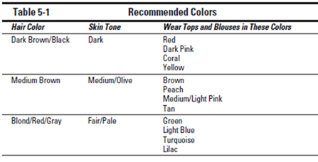
You’ve all heard someone say, “That color looks great on you!” Well, there’s a reason. Some colors work really well with your skin tone and even hair color. You can tell which colors best flatter you by just holding up a few different colored tops below your face to see which ones make you look brighter and which ones wash you out. Too many combinations of skin tones, hair colors, and clothing colors exist to cover them all here, so in this section I focus on the basics to get you started (see Table 5-1 for a quick list of flattering combinations).
Figure 5-7: This outfit has warm, earth tones, perfect for darker skin.
Warm and cool colors
All colors are considered either warm or cool. Colors with red undertones are warm, and colors with blue undertones are cool. If you have darker or olive color skin, warm tones are going to be more flattering. So colors on the warm end of the spectrum like reds, oranges, pinks, peaches, and yellows (pro- vided they don’t have blue undertones) are better for you, as is anything in the brown family (see Figure 5-7).
Just because you have fairer skin doesn’t mean you can’t wear the colors on the warm end of the spectrum. You just have to be careful with the tone of the color. For example, a woman with fair skin can wear pink; it should just be a pink with blue undertones, as in Figure 5-8.
If you have fair, medium, or even pale skin, cooler colors are going to flatter you. Coolers colors — such as greens, blues, purples, and grays — are at the other end of the spectrum from warmer colors. Something like an ice blue top works well on someone with fairer skin (see Figure 5-9).
Figure 5-8: Pink with blue undertones flatters fair skin.
Considering hair color and make up
The other thing to consider when choosing your clothing is hair color. If you have brown or dark brown/black hair, warmer colors are going to look better on you. If you have blond, red, or gray hair, cooler colors look good. For example, someone with brown hair looks better in red, while a blond or red- head looks better in green.
Most often, unless you dye your hair or wear a lot of makeup, people with darker hair tend to have darker or olive skin complexions and women with blond or red hair tend to have fairer skin. So accenting with warmer colors, like the warm pink scarf in Figure 5-10, works on someone with dark hair and dark skin.
Figure 5-9: Cool, pastel colors compliment fair skin.
You can always use makeup as a tool to enhance or change your skin tone, and you can also change your hair color if you want to change your color palette as far as what you choose to wear. You’re not locked in to specific colors, although as you get a feel for what looks good on you, you’ll want to stick to the palette that’s most flattering for you.
Figure 5-10: A warm pink accessory and earth tones flatter dark hair.
Making Your Color Choices Work for You
Your personality, body type, and personal style are going to determine what colors you choose to wear. As long as you understand which colors work together and how to use them to flatter your figure, feel free to experiment with combinations you may not have tried before. You may just find a whole new wardrobe right in your closet!
Pairing colors
The primary colors (red, blue, and yellow) in the brightest shades can be hard to match because their intensities are high in and of themselves. When you pair one primary color with another, the intensity is multiplied and the combination can be too much. However, the primaries, like all colors, have different shades. So where a cherry red may be hard to match with anything but a neutral, a brick red may be less overpowering (any muted primary color is less overpowering).
Following are some other examples of ways to use primary and secondary colors without being overwhelmed by the effect:
✓ Yellow: A bright yellow can be quite difficult to match, but a pastel shade blends nicely with most colors, both analogous and complimentary. If you’re partial to bright yellow, use it as an accent color. Or if you want to use it as the primary color of an outfit, make sure that the rest of the outfit is more subdued (it’s always safe to pair with white).
✓ Green: When it comes to the many shades of green, go with one that looks good on you. If you’re not comfortable wearing bright green, try a subtler shade, like fir green or mint green, instead. A subdued green can go with many other colors, but I’d stay away from pairing it with red, regardless of the shade, unless, of course, it’s Christmas (even then some basic rules exist; see Chapter 12 for tips on dressing for the holidays).
✓ Purple: Because purple is such a strong color, it works best when paired with a pale shade of another color. A lighter shade of purple gives you more leeway when pairing it with other colors. A pale yellow paired with a brighter purple, for example, can be beautiful during springtime.
✓ Blue: Blue is another strong color. For a bright, royal blue, you follow the same rules as with the other bright colors: Pair it with a neutral color or something more toned down. Because most denim clothing is blue, we tend to think it matches everything, but this is only true with lighter and darker shades of blue, as they are toned down already and can be paired with most colors.
So what goes with blue jeans? Almost anything you can name. The only thing that doesn’t go with denim? Denim. I don’t care what magazines say it’s the latest trend; unless you’re taking a time machine back to the 1980s, denim and denim (see Figure 5-11) don’t go together. Ever!
Brighter colors and pastels tend to be worn in spring and summer, and the more muted and subdued shades are worn in fall and winter.
Combining colorful patterns
You can combine colorful patterns as long as you don’t combine colorful patterns that don’t match. Pairing patterns is tricky in and of itself. You can pair patterns as discussed in Chapter 4, but when you throw color into the mix, the color scheme has to match (see Figure 5-12). The items need to be in the exact same color family or one has to be a print in a neutral color scheme.
Figure 5-11: Don’t wear denim with denim!
If each pattern has a dominant color, make sure those two dominant colors are the same. The colors must match exactly when pairing patterns. This pairing should look like it came together from the same designer. In fact, pairing items from the same designer is about the only way to ensure that all the colors and patterns aren’t too busy. Plus, it’s rare to find an exact match when pairing pieces from different designers’ collections.
Using color to impact your mood
Studies have shown that color can have psychological effects. Yellow, for example, is said to help concentration, pink is supposed to make you seem more approachable, and red is an attention-getter.
It’s also said that colors affect your mood. Wear too much black, for example, and you may find yourself feeling sad. Still, no scientific study has proved any such link between color and a particular effect, and because colors have different meanings around the world, these theories are far from proven.
Matching mood to color
While no scientific study makes a direct link between what wearing one color versus another may do for your state of mind, or how the color you wear influences those around you, simple observation tells you
that a lady dressed all in red is going to draw the eye’s attention first over someone dressed in muted tones. While not carved in stone, there are appropriate colors for certain situations:
✓ For somber occasions: Black is obviously acceptable. You can also wear navy, dark browns, and gray.
Figure 5-12: Colors must match when pairing patterns.
✓ For serious occasions: When you’re going for a job interview, keep your color palette on the more subdued side even though the days of wearing simple black pant suits with a button-down blouse are over. A black pencil skirt with a classic sweater set and beautiful necklace (see Figure 5-13) is appropriate and highlights your personal style.
✓ For celebratory events: When you’re attending an occasion that calls for celebration, like a baby shower or graduation party, bring out your bright colors. When attending an event that invites you to have fun, have fun — even with your clothing!
Getting a mood boost from your favorite color To a certain degree, how a color affects your mood can enhance its ability to camouflage problem areas. You’d be surprised that black is not the only color that can hide a problem area. Some larger women, for example, tend not to wear red because they feel it attracts too much attention to their bodies. But red is also a color that exudes confidence. It’s the ultimate power color. If red’s your favorite color, find ways to wear it while still flattering your figure. For example, if you’re a pear shape, wear a red top with a darker bottom. This combination attracts attention to your upper half, allows you to wear a color you love, and camouflages an area you want to minimize.
Get the best of both worlds. Combine the natural slimming effects of wearing dark colors with the brightening effect of wearing your favorite brighter colors. If you prefer a bright color but don’t think it flatters your figure, use the bright color as an accent. You can use accents in so many different ways: shoes, belts, handbags, scarves, jewelry, and so on. Chapter 15 tells you how to accessorize.
Figure 5-13: Muted colors are good for job interviews.
Figure 5-14: The same color on the top and the bottom creates a slimmer line.
Camouflaging with color
Creating color combinations that camouflage is an art form perfected by the military, but the traditional military pattern is not the only way to use color to camouflage. Many people who try to hide their problem areas turn immediately to black and for good reason. Not only is black slimming; it’s also chic. But you don’t have to wear all black all the time. It isn’t the only color that you can use for camouflage. Consider these examples on how to flatter your figure:
✓ Wearing all one color makes you appear taller. A monochromatic outfit helps anyone — from petite to plus-size — project a longer, leaner look, which makes you appear taller and slimmer (see Figure 5-14).
✓ Wearing colors that are in stark contrast to one another make you appear shorter. If you’re tall and want to appear shorter, wear contrasting colors on the top and the bottom. The two colors break up the one long line (see Figure 5-15).
✓ Wearing any color of narrow, vertical stripes makes you look thinner. The thinner the stripe, the more pronounced the slimming effect.
Figure 5-15: Contrasting colors on the top and bottom make you look more petite.
Color meanings
The fashion world talks a lot about the psycho- logical meanings of color. Here’s what proponents of this theory hold to be true. First, colors on the red side of the color wheel are generally considered to be the warm colors, while those on the blue side are the cool ones. While psychologists differ on the importance of color, there’s some agreement on the following points:
✓ Red depicts strength and courage.
✓ Blue is cooler and more intellectual.
✓ Yellow is the emotional color and gives off confidence and optimism.
✓ Green, because it’s in the center of the color spectrum, is the color of balance and
harmony.
✓ Purple is the spiritual color leading to introspection.
✓ Black is both sophisticated and menacing.
✓ White is hygienic, which can stand for good health or sterility.

